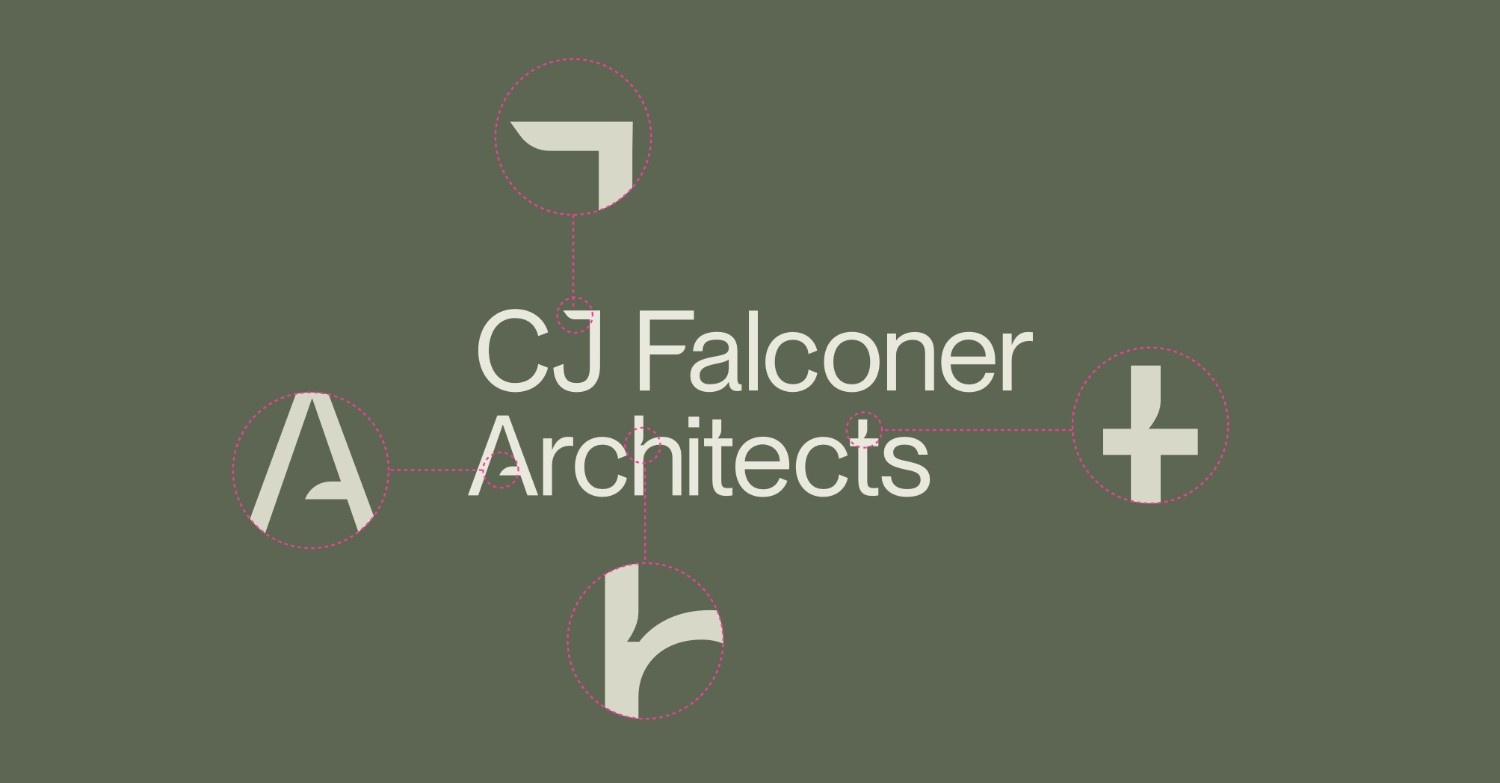
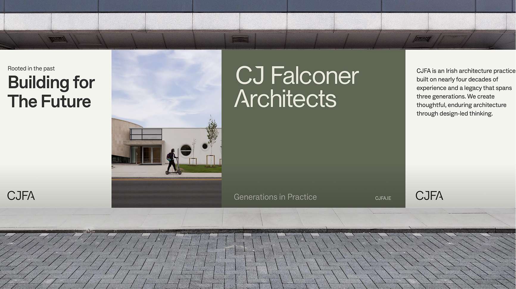
Individual design decisions are deliberately measured rather than dramatic, with layouts guided by a clear grid that provides consistency across print and digital applications. This extends to a supporting graphic motif, abstracted from the C, J, F and A of our name. Used at different scales and orientations, its fine linework makes a subtle reference to architectural drawings, creating a recognisable thread through the wider identity while remaining deliberately secondary to the work itself.
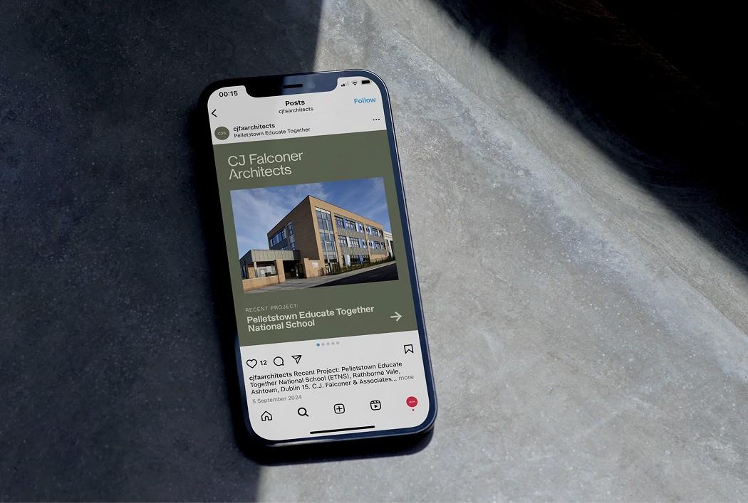
Importantly, our architectural work remains at the centre – and so, one of the principles we shared with Leon was that the identity should support our projects rather than compete with them. The resulting system provides a consistent framework within which our architecture, photography, drawings and ideas can take prominence, whether we are presenting a major public building, a scientific or educational facility, a workplace, a residential development, or a smaller intervention.
That flexibility was particularly important to us. After 40 years, CJFA’s work encompasses a broad range of sectors, clients, building types, and scales. The identity therefore needed enough character to be recognisably ours, without imposing a particular visual language on the architecture itself.